So we are once again back at the famous BeyondTellerrand conference in Dusseldorf, for it's 9th!!!! incarnation here. For me this is only the 2nd time I am here (3rd if you count the one last year in Munich, but I don’t) and it would not have come to that if it was not for my old/new colleague (long story there, ask me in person/comments if you really are that bored) and frontend wizard Francesco Schwarz [@isellsoap].
He was the reason I was here the first time, that one in Munich (the one that doesn’t count) and this year by nagging me to tag along. Even though my development focus HAS shifted a bit from purely backend to app development and also some dabbling in frontend technologies it still feels a bit odd being at such a place.
In my experience most talks concern mostly design principles, working methodologies and creative processes. Of course there are always a few more techy talks around but those, as to be expected, concern web frameworks, browser developments and other flashy and shiny and sparkling thingies.
Don’t get me wrong, this is not a bad thing. Otherwise I would not be here. It is just a very different setting for me. Which is exactly WHY I keep coming back. Seeing what people can do with their creativity, how new ideas try to shift our perception of the world or what is even possible is quite refreshing. For me, this conference really embodies what it’s name promises: an opportunity to take a step back, broaden your horizon, see beyond your known territory and finding the courage to step out of your comfort zone (and maybe one day I will manage that).

Ok, enough huffing and puffing. Let’s get down to business. Francesco and I departed Munich on a shitty and rainy Sunday noon just to arrive to a lovely spring day in Dusseldorf a good hour later. Perfectly smooth journey from soup to nuts. Since we had a few hours to kill we had a stroll to a nearby park where we found a small restaurant and decided to stop for a snack and some refreshments.
After that we set off by foot again to the traditional Warm-Up event, this time hosted by the lovely people at wacom. Apart from chatting with other attendees and lots of free drinks and food we also got the opportunity to try some of their graphic tablets and see what can be done with digital ink.
Something else that is different than at other conferences is the musical accompaniment by Tobi Lessnow. I am not a huge fan of electronic music but the way Tobi incorporates talks into his interludes and especially the show he puts in while thoroughly enjoying his music adds a special kind of flavor to the ambience.
The videos to the talks can be found on the coverage page.
A new addition was the screen with live captioning. Both Francesco and I were surprised by the speed and accuracy of the captioning as it was also able to apply quotation marks correctly and were wondering what software was behind this. Then we found out how it worked. The audio went into a skype call to some place in Scotland where a guy called Andrew simply typed what he heard which was then sent back ;-)
He is giving a quick summary about how other companies are working with shopify and what advantages they gain. You can also see what options you have in theming shopify and what kind of services are available.
You can also create development accounts to have test orders processed and toy around with different settings before migrating them to the production accounts.

The “techy” part of the talk was a short intro to the Liquid Objects templating language with some basics. IMO not much different than other templating mechanisms, it allows you to put data into your layout ;-)
Liam also gave a quick overview over different ways to edit and manage your themes with tools like slate.
In the end this was more or less a little pr gig for shopify but it was done in a nice way and you can’t blame a sponsor for trying to get more attentíon for their product. And there were free subs ;-)
We face constraints in almost every situation of our lives, be it professional or personal. Charlie illustrates this with the fitting analogue of baking a cake for some friends. Some maybe be vegan or cannot have gluten or might even have a life threatening allergy. So baking a cake for all of them is really really hard. So why not just go to a bar instead?
Funny as that is, it has also a lot of truth in it. Usually we perceive constraints as something that is hindering us, something that restricts us in our choices and we therefore regard them as something bad and assume that our work will not be as good as it could be due to these evil constraints.
And here is where Charlie proposes a different approach. Do not fight the constraints, accept and embrace them, let them be a contribution to your work. Some of the examples she lists are haikus or other forms of poetry that attain at least some, if not all, of their beauty because of the adherence to constraints.
Another very moving example is a quote that allegedly stems from Ernest Hemingway. It is said that he made a bet he could write a story containing only 6 words. It sounds rather unlikely but what he, allegedly, came up with was this:
“For sale: baby shoes, never worn”
You might wanna let that sink in for a while.
The main point is: Constraints are not inherently bad, some can be good but most of them are at least necessary. So do not ignore them when you create content, applications or other resources.
But this is actually not the first step. Before you can acknowledge a constraint you must be aware of its existence. Try to remember that there are people with all kinds of needs, preferences and disabilities as well as all kinds of devices out there. Not everyone in the world has a current device or even a moderately common one. Charlie tried to summarize this with this:
“There is infinite technology and infinite humanity”
Ultimately if everyone only builds apps that need the newest hardware we are encouraging people to buy that hardware which causes not only a lot of resources being used to produce said hardware but also will result in more and more older devices being thrown away and polluting the planet even more.
You might find that last conclusion a bit extreme and I agree that relying on a new tech will not cause immediate death of the planet but it is a small part of the bigger problem and even baby steps matter.
That might be a part of the problem. Carolyn tries to point out what a good documentation can and should look like. Consider an app or api you have created, how good is the documentation for it? Did not bother to write one? Or maybe just covered the basics because it is mostly self explanatory? Sure about that?
Carolyn’s background as a technical writer has given her an insight into what usually goes wrong when we write documentation. I will just try to sum up the IMO most important points, if you are interested in more, I recommend watching the video.
What should we take into account when writing documentation:
Mike’s résumé reads quite impressive. He worked in different positions like production design, concept design, etc. on various high profile projects in the filming and gaming industries:
During his illustrious carrier Mike did learn a lot about what a story and the world it takes place in need to captivate the audience and more importantly what kind of mistakes killed high budget fails.
The core concept of Mike’s talk is a construct called the Monomyth. This is an abstract concept that describes the typical journey of a hero in a detailed sequence of phases. This is nothing new but was developed in the 1940s and is based on an analysis of narratives from ancient mythology until modern stories. Almost all great heroic stories can be ascribed to the Monomyth.
I’m trying to give a rough description of the Monomyth but I highly recommend to watch the video as Mike shares a lot of fascinating insights, plus a huge amount of blockbuster material. Depending on the granularity the Monomyth can have a lot of different phases. The most basic one consists of four.
As I said, this is a very condensed version. Watch the talk for a better understanding.
The second concept Mike introduced is the reciprocity of Shadow and Persona. Persona describes a person’s outward behaviour. Our manners we learned by aspiring to meet expectations by our society, family or even jurisdiction. Where as the Shadow resembles our instincts and subconscious desires that we learned to suppress because they are not appropriate. In comics these two are usually represented by an angel and a devil sitting on the shoulders of a character trying to persuade him what he should do.
Furthermore Mike explained the terms the archetypes Chaos, Control, Animus and Anima using Jurassic Park.
Animus describe the attributes traditionally associated with males, like sternness, protection or strength. While Anima describes the traditionally female attributes like nurturing and loving. In Jurassic Park those two archetypes are represented by Grant and Ellie who during the evolution of the story both must learn to also develop the qualities of the complement archetype.
The Control archetype is usually assigned to some god like creator, someone who is in charge and wants to make the world better. In this example this archetype is taken by the role of Hammond, the director. He is creating live, a whole world. All with good intentions and is sympathetic to everyone, even towards Malcolm the representative of the Chaos archetype. He is stirring things up, questions the Control archetype and is generally a huge pain. As the story develops these two need to understand each other’s positions and learn to work together to save everyone from disaster.
Again, this is only scratch on the surface of this talk. Go watch it now!
When he joined Trivago the website, despite just having undergone a rewrite, was in a chaotic state. There were no style guides or processes to design changes. Sometimes there were just screenshots in a JIRA ticket and the developers used a color picker to determine what color to use. That resulted in about 40+ different tones of grey and similar multitudes of green or orange. CSS and HTML were in a desolate state.
Christoph and his team set out to change this and started to implement a design system as a pattern library to unify the diversities. Over the years they put in more and more effort but struggled along the way as there were a lot of problems to correct. At one point they analysed the usage of their lib was hardly used in the main Trivago website but mainly in side applications.
Several other issues finally lead to the abandonment of the library even though a lot of time and effort went into it.
I found it very courageous to hold this kind of talk and openly speak about a failed project of these proportions. After all usually people only talk about their successes but our failures is where we and others can learn the most from.
His main learnings where that if you want to talk a problem like this you need to start small. Do not approach all problems at once but limit yourself to the most pressing ones. On the other hand you should aim high, meaning that you should try to build a good and well thought through solution, because a lukewarm approach will raise other issues later on. And finally try not to underestimate the difficulty and complexity ahead, do not approach it light-hearted or it will come around to bite you in the arse.
With most talks about creative work a simple description here does not do justice. Red takes us on journey through her creative and personal life which are both intertwined closely. I will only give a few short examples of her work but, I gotta say it again, watch the video.
She started of by showing how she painted a portrait of a Chinese NBA player but instead of using a brush, she dipped a basket ball into the paint and dribbled it on the canvas.
Another one was where she used socks connected with clips as a kind of pixels to create a huge picture.
Or bundling chopsticks in packages of different sizes to also create a pixel style portrait of Jackie Chan (and I apologize for not memorizing the names of the other people portrayed).
Throughout the talk Red inspires with her authentic and honest love for art. So go and click that video link!
This was less like a regular talk but more like a fast forward slide show through his life and work showing an immense amount if diverse designs, logos and layouts, as well as some design fails he encountered on the way. All accompanied by funny anecdotes. We had a lot of laughs in this one.
 What I took away from this talk can be boiled down to this: Tools are there to assist you but not to make decisions for you. You have to decide what a design should look like not the tools and not templates that “everyone uses”. Also if you have different ideas, let your customer choose from them, do not withhold alternatives from them.
But apart from that, you guessed it, watch that video ;-) But when it gets close to the end, make sure to sit down. You will know what I mean when you see it.
In school he started doing graffiti which got him interested in art. He then worked at a fashion store building props from all kinds of things always struggling with a tight budget. Then the shop was bought by another company and was closed down to move north of England.
So he was out of work and had to find day to day jobs to survive. At one point he started drawing on cups in coffee shops just for himself. He kept drawing and drawing and at one point a newspaper found out about his great drawings and published an article about him. From there on he got more and more publicity and job offers.
He had a house, a family, his office at home, life was good. But then the downward spiral hit again. A Burglary where people stole a lot of stuff from his shed, his dog dies unexpectedly and then his wife wanted a divorce.
Rob had to move in with his sister and had a deal with his wife, that he could use the office at the house during the day, so he was driving back and forth and figured he would soon be able to move out of his sisters living room. Then he got pulled over by the police because his car insurance ran out and the car got confiscated plus he suffered from a bad case of sciatica. Due to his housing and financial situation no bank would loan him money.
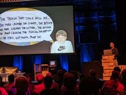
What helped him to keep moving instead of giving up, was his son. He wanted to be able to provide him with all the things a kid should have. After some time he realized, he did not need an office, he could work anywhere where wifi was. So he got the cheapest possible tripod he could find and set out to do more of his “play work”. Uploaded it and kept pushing to find new clients.
Thanks to his persistence he succeeded. He kept pushing against all odds and came out ahead. This story in itself was already inspiring but add in his really amazing drawing skills and you have a great talk.
This talk is worth to watch as well in my opinion.
Mozilla is investing into web based VR development for several reasons. They want it accessible to as many people as possible. Companies like Facebook or Google also develop VR devices but they keep it proprietary enclosing their users in their ecosystem. This is a development Mozilla considers not only undesirable but also dangerous and thus they want to help providing a standardised and open alternative.
With WebGL 2.0 exists a way to have performant VR applications in the browser. It is still not perfect but the evolution is a long way from done so they expect to improve the experience more and more.
I mean, how can you get bored when someone tells you he is designing stuff for NASA at JPL? Admittedly nothing that goes to space. Instead David created projects to either raise people’s interest in certain missions or to visualize data.
E.g. when the Rosetta mission was about to land he created an artificial comet in a pool with fog to see how people would react to it, yielding unexpected and interesting results.
Or when he was shown Goldstone areal (big antennas to communicate with the different spacecrafts in orbit) he create a waterfall of light that shows in real time when data is transmitted from or to a spacecraft.
Once again words are not enough to describe his cool projects especially a music video he made with school kids about traveling to mars. Just check it out!
But if I had to deduct a moral from this it would be: Curiosity can outgrow fear.
Humans just need a small glimpse of hope to overcome fears and dare to leap into the unknown. Embrace your curiosity.
Get-together and evening beer
As usual the end of the first day has the obligatory get-together to discuss the events of the day with free drinks from the bar.
So Marc gave this task to a veteran and only a few minutes in he had gotten everyone on their toes. Stephen started by cycling back to day 1 incorporating parts of the talks as references into his own.
Like Dave Carson he stressed the point that if you want to be different then be different but not in the same way that everyone else is different. He reenforced this statement with a lot of fitting examples how most of the “hip” websites just look the same.
As I already touched on in the prelude, nothing exciting happens in the comfort zone. You need to push the boundaries in order to create something special. An example for this was the design of Tesla. It still is a car, it has wheels, a body, headlights and windows. But it’s inside feels different, not so different that you can’t relate to it, but different enough that it changes the way you interact with it and perceive it.
We are prone to try grasping the low hanging fruits of creativity but instead we should try new things. Learn from what we find out be it failure or success and then start over again. But most of all we should be critical thinkers. Do not accept what “everyone knows” make your own experiences. And with regard to that you should not take my word for granted but see for yourself ;-) Again a video well worth watching.
Shirley gives us an overview of her previous works, what different aspects of data can be used to group and finally display it.
Actually what I remember most of this talk is something rather sad or even upsetting about the data of one of her projects. It seems that it is common in the US for cities to have their homeless stuffed into busses or even planes to bring them to other cities or maybe even other countries!! TBH that made me sick!!!
But back to the matter at hand. One part of the talk was a live coding session to recreate one of her visualizations. It was interesting to see how the different tools can work together to create great animations. Unfortunately the live coding was maybe a bit too well rehearsed as it was really quick and therefore a bit hard to follow.
What impressed me though was that Shirley combined D3, VUE and Greensock in a tool stack by replacing mechanisms in one with equivalents of the other in order to make the code more lean.
The main reason why Zach advocates the use Web Fonts is that you should give your reader the best reading experience you can. Of course saving bytes is an important aspect of a website but in his opinion the extra bytes needed by Web Fonts as opposed to system fonts is worth it.
The different heat levels in Zach’s talk related to different things you should consider in regard to fonts on your website.
Often font declarations can be simplified especially when they refer to default fonts. The so called bulletproof font face declaration can also be shortened. Mixing local and url font-face declaration is discouraged.
If you want to find out more about the fonts used on a site you can use the fonts tab in the firefox dev tools. Also fonts are a kind of software so they also need maintenance and updates.
As with every talk about Web Fonts there was also the well known Romney example for a FOIT. Here the new directive “font-display: swap” is useful as it will cause the fallback font to be used immediately and then being swapped out once the desired font is loaded.
Two more sections that I found interesting was the overview of different licencing models available for Web Fonts as well as hosting options.
As with all talks before this is only an excerpt and I once again recommend the video (again a lot of laughs) at least if you are interested in Web Fonts at all.
The whole session was recorded by Working Draft and will be up on their podcast within the next weeks.
What concerned people the most was why the team decided to take this step and if that does not give too much power to Chromium or on the other hand makes life too hard for Gecko.
In the start the Edge team set out to create a browser that is as standard conform as possible. But soon they encountered problems as many many sites on the web did not conform to those standards and so did not work in Edge. Breaking the web was not an option for them, so they tried to cope with those sites but in the end it was just too complicated.
So they decided to contribute to the Chromium project instead. In their view this gives them the advantage of a browser engine that works well also with non standard sites and on the other hand has the benefit that there are now two big players in the Chromium project so not all the power is in one hand. Also this allows them to release Edge independent of Windows so they can have shorter release cycles.
On the other hand they hope the Gecko engine will continue to be around to have more diversity and not only one engine for all browsers. IMO this sounds a bit hypocritical as the Gecko guys could use the same arguments to switch to Chromium, but it is their (Edge) call.
Having two big companies with a say in the Chromium project also gives rise to the question, what happens if there is a disagreement? The only answer there was basically “We expect that not to be a problem as everyone in the project wants a pragmatic solution.” This view is underpinned by the fact that the real distinction among browsers does not stem from the engine but from what the browser does with it.
Other news were that the old Edge will be replaced once the new version comes out but Internet Explorer will still be installable in parallel. Also Edge will have a list of sites only working with Internet Explorer and open all these sites in a tab using the Trident engine. Plus links opened in the Trident tab that do not require the engine will be opened in tab with Chromium engine.
Also a lot of the features from the existing Edge engine are ported to the Chromium project. Edge will come to Mac and Linux system and a release will use most current Chromium version.
Unfortunately this does not work for all of us, as having a nap at the office might cause issues with the boss ;-)
In her amusing and wonderful talk Doro takes us on a tour through her world of lovely weirdness. If this talk was not worth watching for the animations on themselves she gives us delightful insights into her way of thinking. From “boring your brain” over “lateral thinking” to the “right to be inefficient”.
There should be something to take away from this talk for everyone.
The problem at hand: Flexbox allows you to have items placed in a single row on a wide screen. In a very narrow layout the same flexbox puts all elements in one column. In between these two edge scenarios elements are placed in a kind of grid where the elements in the lowest row get stretched out to align with the other rows. This middle step is sometimes undesirable so Heydon wanted to find a solution to skip it.
This introduction was followed up by another funny and very informative talk. So again, watch the video as I can yet again only give a brief summary.
Whenever Heydon started discussing this idea some people suggested media queries. The issue with this approach is, that media queries take the dimensions of the device/viewport into account and not that of the containing element. So this is not a viable solution.
What would be suitable are container queries but according to Heydon using those caused severe browser issues. What works is a javascript based solution using observables to react to the parent element’s width but what we want is a pure css solution.
What follows is a description on how to combine different css properties and functions (calc, width, ..) in more and more complex steps leading to something called the Fab Four technique that was already developed before Heydon got to this point. But Heydon keeps on improving and refining the solution into a more elegant version of algorithmic layout in pure css.
Even if you are familiar with the final result, the talk is still worth to watch, if only for the entertainment value.
This time it was different. Tantek is an advocate for the IndieWeb movement and highly involved with the W3C. He is one of the driving forces behind the developments for an independent web for everyone.
Using strong pictures and videos Tantek shows us, what the web should and could be about. How we should shape it to what we want it to be instead of relying on platforms like Facebook or Google to tell us what to watch and read.
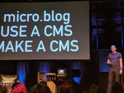
“Take Back Your Web” is the perfect title for this talk and something we all not only should but have to pursue. Apart from preaching of what not to do, Tantek also shows what can be done to have unique and independent presence on the web. He introduces tools from a starter kit for your own github web site (indieweb/blank-gh-site) to WebMentions and MicroFormats2.
It was a very seizing presentation for the IndieWeb movement and if you are not yet familiar with it you need to watch this talk.
He was the reason I was here the first time, that one in Munich (the one that doesn’t count) and this year by nagging me to tag along. Even though my development focus HAS shifted a bit from purely backend to app development and also some dabbling in frontend technologies it still feels a bit odd being at such a place.
In my experience most talks concern mostly design principles, working methodologies and creative processes. Of course there are always a few more techy talks around but those, as to be expected, concern web frameworks, browser developments and other flashy and shiny and sparkling thingies.
Don’t get me wrong, this is not a bad thing. Otherwise I would not be here. It is just a very different setting for me. Which is exactly WHY I keep coming back. Seeing what people can do with their creativity, how new ideas try to shift our perception of the world or what is even possible is quite refreshing. For me, this conference really embodies what it’s name promises: an opportunity to take a step back, broaden your horizon, see beyond your known territory and finding the courage to step out of your comfort zone (and maybe one day I will manage that).

Ok, enough huffing and puffing. Let’s get down to business. Francesco and I departed Munich on a shitty and rainy Sunday noon just to arrive to a lovely spring day in Dusseldorf a good hour later. Perfectly smooth journey from soup to nuts. Since we had a few hours to kill we had a stroll to a nearby park where we found a small restaurant and decided to stop for a snack and some refreshments.
After that we set off by foot again to the traditional Warm-Up event, this time hosted by the lovely people at wacom. Apart from chatting with other attendees and lots of free drinks and food we also got the opportunity to try some of their graphic tablets and see what can be done with digital ink.
General Notes
BeyondTellerrand is a special kind of conference not only aiming for technical talks or focusing on a single profession. It is always about people. The speakers, the attendants and the community. Marc takes great pride in finding special speakers with unique backgrounds and maintaining a familial atmosphere throughout the whole event. This also includes promoting charity events on the stage and their own booth.Something else that is different than at other conferences is the musical accompaniment by Tobi Lessnow. I am not a huge fan of electronic music but the way Tobi incorporates talks into his interludes and especially the show he puts in while thoroughly enjoying his music adds a special kind of flavor to the ambience.
The videos to the talks can be found on the coverage page.
A new addition was the screen with live captioning. Both Francesco and I were surprised by the speed and accuracy of the captioning as it was also able to apply quotation marks correctly and were wondering what software was behind this. Then we found out how it worked. The audio went into a skype call to some place in Scotland where a guy called Andrew simply typed what he heard which was then sent back ;-)
Day 1
In addition to the regular talks the first day also featured 3 side events hosted by some of the sponsors in a side room with a max of 100 attendees. First one was the…Shopify Breakfast Session - Liam Griffin [@liam_at_shopify]
If you already know what shopify is all about, this talk is not for you. For everyone else, go have look. Liam is giving an overview of what shopify does, how you can use and integrate it.He is giving a quick summary about how other companies are working with shopify and what advantages they gain. You can also see what options you have in theming shopify and what kind of services are available.
You can also create development accounts to have test orders processed and toy around with different settings before migrating them to the production accounts.

The “techy” part of the talk was a short intro to the Liquid Objects templating language with some basics. IMO not much different than other templating mechanisms, it allows you to put data into your layout ;-)
Liam also gave a quick overview over different ways to edit and manage your themes with tools like slate.
In the end this was more or less a little pr gig for shopify but it was done in a nice way and you can’t blame a sponsor for trying to get more attentíon for their product. And there were free subs ;-)
All Constraints are Beautiful - Charlie Owen [@sonniesedge, sonniesedge.net]
Official opening talk. Always a tough job to get the crowd started. But Charlie did just that without breaking a sweat. The talk was not only very funny but also fascinating. Check out the video.We face constraints in almost every situation of our lives, be it professional or personal. Charlie illustrates this with the fitting analogue of baking a cake for some friends. Some maybe be vegan or cannot have gluten or might even have a life threatening allergy. So baking a cake for all of them is really really hard. So why not just go to a bar instead?
Funny as that is, it has also a lot of truth in it. Usually we perceive constraints as something that is hindering us, something that restricts us in our choices and we therefore regard them as something bad and assume that our work will not be as good as it could be due to these evil constraints.
And here is where Charlie proposes a different approach. Do not fight the constraints, accept and embrace them, let them be a contribution to your work. Some of the examples she lists are haikus or other forms of poetry that attain at least some, if not all, of their beauty because of the adherence to constraints.
Another very moving example is a quote that allegedly stems from Ernest Hemingway. It is said that he made a bet he could write a story containing only 6 words. It sounds rather unlikely but what he, allegedly, came up with was this:
“For sale: baby shoes, never worn”
You might wanna let that sink in for a while.
The main point is: Constraints are not inherently bad, some can be good but most of them are at least necessary. So do not ignore them when you create content, applications or other resources.
But this is actually not the first step. Before you can acknowledge a constraint you must be aware of its existence. Try to remember that there are people with all kinds of needs, preferences and disabilities as well as all kinds of devices out there. Not everyone in the world has a current device or even a moderately common one. Charlie tried to summarize this with this:
“There is infinite technology and infinite humanity”
Ultimately if everyone only builds apps that need the newest hardware we are encouraging people to buy that hardware which causes not only a lot of resources being used to produce said hardware but also will result in more and more older devices being thrown away and polluting the planet even more.
You might find that last conclusion a bit extreme and I agree that relying on a new tech will not cause immediate death of the planet but it is a small part of the bigger problem and even baby steps matter.
Humanising Your Documentation - Carolyn Stransky [@carolstran, carolstran.github.io]
“Oh yeah, writing documentation!! Awesome!!!!” That’s what we are all thinking when that task comes up, right? Uhm.. ok.. maybe not quite as enthusiastic.That might be a part of the problem. Carolyn tries to point out what a good documentation can and should look like. Consider an app or api you have created, how good is the documentation for it? Did not bother to write one? Or maybe just covered the basics because it is mostly self explanatory? Sure about that?
Carolyn’s background as a technical writer has given her an insight into what usually goes wrong when we write documentation. I will just try to sum up the IMO most important points, if you are interested in more, I recommend watching the video.
What should we take into account when writing documentation:
- Do not start with the documentation when you are in the implementation phase or even later. Embed the documentation into you design process when you specify the use case you are going to implement. Make sure it gets updated as the specification evolves and use it as acceptance criteria to see if everything behaves as you specified
- Do not only describe what a buttons does or how an api endpoint can be used (reference doc) but also create documentation telling the user how to achieve something with it (use case documentation) e.g. how several api calls can be combined to complete a workflow
- Consider when people are usually reading docs, like at the same times when you are reading docs:
- When you failed to do what you wanted on your own
- When something is not working as expected
- When people are frustrated or confused…
- do not use words like "easy", "simply" etc.
- it is better to show than tell (examples, videos)
- take a step back and consider that readers do not have your knowledge about the product
- use tools like hemingway, write-good or alex.js
- use a clear structure
- a11y!!!
- ….
The Power of Metaphor - Mike Hill [mikehill.design, mikehill.design]
Here comes deluxe nerd stuff. A talk including super heros, magic, sci fi, dinosaurs and much much more. So buckle up!Mike’s résumé reads quite impressive. He worked in different positions like production design, concept design, etc. on various high profile projects in the filming and gaming industries:
- Horizon Zero Dawn
- Call Of Duty: Infinite Warfare
- Blade Runner 2049
- Love, Death + Robots
- ...
During his illustrious carrier Mike did learn a lot about what a story and the world it takes place in need to captivate the audience and more importantly what kind of mistakes killed high budget fails.
The core concept of Mike’s talk is a construct called the Monomyth. This is an abstract concept that describes the typical journey of a hero in a detailed sequence of phases. This is nothing new but was developed in the 1940s and is based on an analysis of narratives from ancient mythology until modern stories. Almost all great heroic stories can be ascribed to the Monomyth.
I’m trying to give a rough description of the Monomyth but I highly recommend to watch the video as Mike shares a lot of fascinating insights, plus a huge amount of blockbuster material. Depending on the granularity the Monomyth can have a lot of different phases. The most basic one consists of four.
- The known and the old self: This is where a story begins. Mike used Star Wars as an example here. At the start Luke is at home living his live, then comes a call to adventure in form the message from Lea. Luke meets his Mentor Obi-Wan but at first refuses to follow the call until some tragic events force him to go.
- The unknown and the old self: Here the hero finds allies, here Han and Chewie, has to pass tests make friends etc. until he has some kind of traumatic experience that leads a form rebirth (the dumpster scene)
- The unknown and the new self: The hero finds some kind of reward for his struggles and fully transforms into his new self.
- The known and the new self: Our hero returns home usually triumphant etc.
As I said, this is a very condensed version. Watch the talk for a better understanding.
The second concept Mike introduced is the reciprocity of Shadow and Persona. Persona describes a person’s outward behaviour. Our manners we learned by aspiring to meet expectations by our society, family or even jurisdiction. Where as the Shadow resembles our instincts and subconscious desires that we learned to suppress because they are not appropriate. In comics these two are usually represented by an angel and a devil sitting on the shoulders of a character trying to persuade him what he should do.
Furthermore Mike explained the terms the archetypes Chaos, Control, Animus and Anima using Jurassic Park.
Animus describe the attributes traditionally associated with males, like sternness, protection or strength. While Anima describes the traditionally female attributes like nurturing and loving. In Jurassic Park those two archetypes are represented by Grant and Ellie who during the evolution of the story both must learn to also develop the qualities of the complement archetype.
The Control archetype is usually assigned to some god like creator, someone who is in charge and wants to make the world better. In this example this archetype is taken by the role of Hammond, the director. He is creating live, a whole world. All with good intentions and is sympathetic to everyone, even towards Malcolm the representative of the Chaos archetype. He is stirring things up, questions the Control archetype and is generally a huge pain. As the story develops these two need to understand each other’s positions and learn to work together to save everyone from disaster.
Again, this is only scratch on the surface of this talk. Go watch it now!
Trivago Lunch Break Session: Lessons Learned From Running a Design System - Christoph Reinartz [@PistenPrinz]
Christoph shared his experiences when he joined the folk at Trivago about the status quo he found, his aspirations to improve on the situation and the learnings he took from this.When he joined Trivago the website, despite just having undergone a rewrite, was in a chaotic state. There were no style guides or processes to design changes. Sometimes there were just screenshots in a JIRA ticket and the developers used a color picker to determine what color to use. That resulted in about 40+ different tones of grey and similar multitudes of green or orange. CSS and HTML were in a desolate state.
Christoph and his team set out to change this and started to implement a design system as a pattern library to unify the diversities. Over the years they put in more and more effort but struggled along the way as there were a lot of problems to correct. At one point they analysed the usage of their lib was hardly used in the main Trivago website but mainly in side applications.
Several other issues finally lead to the abandonment of the library even though a lot of time and effort went into it.
I found it very courageous to hold this kind of talk and openly speak about a failed project of these proportions. After all usually people only talk about their successes but our failures is where we and others can learn the most from.
His main learnings where that if you want to talk a problem like this you need to start small. Do not approach all problems at once but limit yourself to the most pressing ones. On the other hand you should aim high, meaning that you should try to build a good and well thought through solution, because a lukewarm approach will raise other issues later on. And finally try not to underestimate the difficulty and complexity ahead, do not approach it light-hearted or it will come around to bite you in the arse.
Making Art With Familiar Objects - Red Hong Yi [@redhongyi, redhongyi, redhongyi.com]
I will say this for a lot of talks in this post but seriously: Watch that video!!!!With most talks about creative work a simple description here does not do justice. Red takes us on journey through her creative and personal life which are both intertwined closely. I will only give a few short examples of her work but, I gotta say it again, watch the video.
She started of by showing how she painted a portrait of a Chinese NBA player but instead of using a brush, she dipped a basket ball into the paint and dribbled it on the canvas.
Another one was where she used socks connected with clips as a kind of pixels to create a huge picture.
Or bundling chopsticks in packages of different sizes to also create a pixel style portrait of Jackie Chan (and I apologize for not memorizing the names of the other people portrayed).
Throughout the talk Red inspires with her authentic and honest love for art. So go and click that video link!
Never Snap to Guides - David Carson [@d_carson_design, davidcarsondesign.com, davidcarson]
If there is one thing to say about Dave Carson, he is a special kind of snowflake ;-) which I say with a lot of respect. His carrier is characterized by his strive to challenge conformity.This was less like a regular talk but more like a fast forward slide show through his life and work showing an immense amount if diverse designs, logos and layouts, as well as some design fails he encountered on the way. All accompanied by funny anecdotes. We had a lot of laughs in this one.
 What I took away from this talk can be boiled down to this: Tools are there to assist you but not to make decisions for you. You have to decide what a design should look like not the tools and not templates that “everyone uses”. Also if you have different ideas, let your customer choose from them, do not withhold alternatives from them.
 But apart from that, you guessed it, watch that video ;-) But when it gets close to the end, make sure to sit down. You will know what I mean when you see it.
Hard Work, Relentless Dreams and WiFi - Rob Draper [@robdraper1, robdraper1, robdraper.co.uk]
This was hands down the most personal talk of this conference. Rob shared his life’s story with us through all the ups and downs and how he kept on pushing to get back up.In school he started doing graffiti which got him interested in art. He then worked at a fashion store building props from all kinds of things always struggling with a tight budget. Then the shop was bought by another company and was closed down to move north of England.
So he was out of work and had to find day to day jobs to survive. At one point he started drawing on cups in coffee shops just for himself. He kept drawing and drawing and at one point a newspaper found out about his great drawings and published an article about him. From there on he got more and more publicity and job offers.
He had a house, a family, his office at home, life was good. But then the downward spiral hit again. A Burglary where people stole a lot of stuff from his shed, his dog dies unexpectedly and then his wife wanted a divorce.
Rob had to move in with his sister and had a deal with his wife, that he could use the office at the house during the day, so he was driving back and forth and figured he would soon be able to move out of his sisters living room. Then he got pulled over by the police because his car insurance ran out and the car got confiscated plus he suffered from a bad case of sciatica. Due to his housing and financial situation no bank would loan him money.

What helped him to keep moving instead of giving up, was his son. He wanted to be able to provide him with all the things a kid should have. After some time he realized, he did not need an office, he could work anywhere where wifi was. So he got the cheapest possible tripod he could find and set out to do more of his “play work”. Uploaded it and kept pushing to find new clients.
Thanks to his persistence he succeeded. He kept pushing against all odds and came out ahead. This story in itself was already inspiring but add in his really amazing drawing skills and you have a great talk.
This talk is worth to watch as well in my opinion.
Mozilla Evening Break Session: VR and AR in the browser, how Mozilla is pushing the boundaries of reality - Fabien Benetou [@utopiah]
Fabien is very passionate about not only VR/AR but also about the open source culture and helping others. He is working with UNICEF to help bring education to people in developing countries.Mozilla is investing into web based VR development for several reasons. They want it accessible to as many people as possible. Companies like Facebook or Google also develop VR devices but they keep it proprietary enclosing their users in their ecosystem. This is a development Mozilla considers not only undesirable but also dangerous and thus they want to help providing a standardised and open alternative.
With WebGL 2.0 exists a way to have performant VR applications in the browser. It is still not perfect but the evolution is a long way from done so they expect to improve the experience more and more.
Imagination, Desire and the Call of the Future - David Delgado [davidjdelgado.com]
Okay, last talk of the day. Everyone is a bit exhausted and I am afraid I might drift off soon. But that was washed away after a few minutes.I mean, how can you get bored when someone tells you he is designing stuff for NASA at JPL? Admittedly nothing that goes to space. Instead David created projects to either raise people’s interest in certain missions or to visualize data.

E.g. when the Rosetta mission was about to land he created an artificial comet in a pool with fog to see how people would react to it, yielding unexpected and interesting results.
Or when he was shown Goldstone areal (big antennas to communicate with the different spacecrafts in orbit) he create a waterfall of light that shows in real time when data is transmitted from or to a spacecraft.
Once again words are not enough to describe his cool projects especially a music video he made with school kids about traveling to mars. Just check it out!
But if I had to deduct a moral from this it would be: Curiosity can outgrow fear.
Humans just need a small glimpse of hope to overcome fears and dare to leap into the unknown. Embrace your curiosity.
Get-together and evening beer
As usual the end of the first day has the obligatory get-together to discuss the events of the day with free drinks from the bar.
Day 2
I Don't Care What Airbnb is Doing - Stephen Hay [@stephenhay, the-haystack.com]
Kicking off day 2 is probably the hardest challenge a speaker can be confronted with. You have to deal with the audience’s expectation after the first day plus the fact that most are probably quite hung over.So Marc gave this task to a veteran and only a few minutes in he had gotten everyone on their toes. Stephen started by cycling back to day 1 incorporating parts of the talks as references into his own.
Like Dave Carson he stressed the point that if you want to be different then be different but not in the same way that everyone else is different. He reenforced this statement with a lot of fitting examples how most of the “hip” websites just look the same.
As I already touched on in the prelude, nothing exciting happens in the comfort zone. You need to push the boundaries in order to create something special. An example for this was the design of Tesla. It still is a car, it has wheels, a body, headlights and windows. But it’s inside feels different, not so different that you can’t relate to it, but different enough that it changes the way you interact with it and perceive it.
We are prone to try grasping the low hanging fruits of creativity but instead we should try new things. Learn from what we find out be it failure or success and then start over again. But most of all we should be critical thinkers. Do not accept what “everyone knows” make your own experiences. And with regard to that you should not take my word for granted but see for yourself ;-) Again a video well worth watching.
Data, Design, Code - Shirley Wu [@sxywu]
It is always impressive when you see what a skilled visualiser can do with simple data.Shirley gives us an overview of her previous works, what different aspects of data can be used to group and finally display it.
Actually what I remember most of this talk is something rather sad or even upsetting about the data of one of her projects. It seems that it is common in the US for cities to have their homeless stuffed into busses or even planes to bring them to other cities or maybe even other countries!! TBH that made me sick!!!
But back to the matter at hand. One part of the talk was a live coding session to recreate one of her visualizations. It was interesting to see how the different tools can work together to create great animations. Unfortunately the live coding was maybe a bit too well rehearsed as it was really quick and therefore a bit hard to follow.
What impressed me though was that Shirley combined D3, VUE and Greensock in a tool stack by replacing mechanisms in one with equivalents of the other in order to make the code more lean.
The Scoville Scale of Web Font Loading Opinions - Zach Leatherman [@zachleat, zachleat.com]
Zach is a Web Fonts enthusiast through and through. As it seems he is also into spicy food as his talk is divided into different steps referring the Scoville Scale. So brace your brain and taste buds for Web Fonts hotness!The main reason why Zach advocates the use Web Fonts is that you should give your reader the best reading experience you can. Of course saving bytes is an important aspect of a website but in his opinion the extra bytes needed by Web Fonts as opposed to system fonts is worth it.
The different heat levels in Zach’s talk related to different things you should consider in regard to fonts on your website.
Often font declarations can be simplified especially when they refer to default fonts. The so called bulletproof font face declaration can also be shortened. Mixing local and url font-face declaration is discouraged.
If you want to find out more about the fonts used on a site you can use the fonts tab in the firefox dev tools. Also fonts are a kind of software so they also need maintenance and updates.
As with every talk about Web Fonts there was also the well known Romney example for a FOIT. Here the new directive “font-display: swap” is useful as it will cause the fallback font to be used immediately and then being swapped out once the desired font is loaded.
Two more sections that I found interesting was the overview of different licencing models available for Web Fonts as well as hosting options.
As with all talks before this is only an excerpt and I once again recommend the video (again a lot of laughs) at least if you are interested in Web Fonts at all.
Microsoft Lunch Time Session: “Edge on Chromium” Ask me anything - Chris Heilmann [@codepo8], Working Draft Podcast [@workingdraft]
This was designed as an Q&A session for the attendants but in order to get things started the guys from Working Draft podcast kicked it off with some questions.The whole session was recorded by Working Draft and will be up on their podcast within the next weeks.
What concerned people the most was why the team decided to take this step and if that does not give too much power to Chromium or on the other hand makes life too hard for Gecko.
In the start the Edge team set out to create a browser that is as standard conform as possible. But soon they encountered problems as many many sites on the web did not conform to those standards and so did not work in Edge. Breaking the web was not an option for them, so they tried to cope with those sites but in the end it was just too complicated.
So they decided to contribute to the Chromium project instead. In their view this gives them the advantage of a browser engine that works well also with non standard sites and on the other hand has the benefit that there are now two big players in the Chromium project so not all the power is in one hand. Also this allows them to release Edge independent of Windows so they can have shorter release cycles.
On the other hand they hope the Gecko engine will continue to be around to have more diversity and not only one engine for all browsers. IMO this sounds a bit hypocritical as the Gecko guys could use the same arguments to switch to Chromium, but it is their (Edge) call.
Having two big companies with a say in the Chromium project also gives rise to the question, what happens if there is a disagreement? The only answer there was basically “We expect that not to be a problem as everyone in the project wants a pragmatic solution.” This view is underpinned by the fact that the real distinction among browsers does not stem from the engine but from what the browser does with it.
Other news were that the old Edge will be replaced once the new version comes out but Internet Explorer will still be installable in parallel. Also Edge will have a list of sites only working with Internet Explorer and open all these sites in a tab using the Trident engine. Plus links opened in the Trident tab that do not require the engine will be opened in tab with Chromium engine.
Also a lot of the features from the existing Edge engine are ported to the Chromium project. Edge will come to Mac and Linux system and a release will use most current Chromium version.
Napworking - Dorobot [@dorobot, dorobot, dorobot.de]
Who doesn’t like a good nap? So does Doro and she now even found how this helps her creativity. In the minutes when she is having a lie down on the couch letting the thoughts drift off shortly before falling asleep the best of ideas arise.
Unfortunately this does not work for all of us, as having a nap at the office might cause issues with the boss ;-)
In her amusing and wonderful talk Doro takes us on a tour through her world of lovely weirdness. If this talk was not worth watching for the animations on themselves she gives us delightful insights into her way of thinking. From “boring your brain” over “lateral thinking” to the “right to be inefficient”.
There should be something to take away from this talk for everyone.
Flexbox Holy Albatross - Heydon Pickering [@heydonworks, heydonworks.com]
As much as I appreciate the creative talks on BeyondTellerrand I was really happy to see a pure technical talk.The problem at hand: Flexbox allows you to have items placed in a single row on a wide screen. In a very narrow layout the same flexbox puts all elements in one column. In between these two edge scenarios elements are placed in a kind of grid where the elements in the lowest row get stretched out to align with the other rows. This middle step is sometimes undesirable so Heydon wanted to find a solution to skip it.
This introduction was followed up by another funny and very informative talk. So again, watch the video as I can yet again only give a brief summary.
Whenever Heydon started discussing this idea some people suggested media queries. The issue with this approach is, that media queries take the dimensions of the device/viewport into account and not that of the containing element. So this is not a viable solution.
What would be suitable are container queries but according to Heydon using those caused severe browser issues. What works is a javascript based solution using observables to react to the parent element’s width but what we want is a pure css solution.
What follows is a description on how to combine different css properties and functions (calc, width, ..) in more and more complex steps leading to something called the Fab Four technique that was already developed before Heydon got to this point. But Heydon keeps on improving and refining the solution into a more elegant version of algorithmic layout in pure css.
Even if you are familiar with the final result, the talk is still worth to watch, if only for the entertainment value.
Take Back Your Web - Tantek Çelik [@t, tantek.com, tantek]
In the previous instances of BeyondTellerrand I attended the last talk was always something light and breezy. An entertaining talk to release the audience with a smile.This time it was different. Tantek is an advocate for the IndieWeb movement and highly involved with the W3C. He is one of the driving forces behind the developments for an independent web for everyone.
Using strong pictures and videos Tantek shows us, what the web should and could be about. How we should shape it to what we want it to be instead of relying on platforms like Facebook or Google to tell us what to watch and read.

“Take Back Your Web” is the perfect title for this talk and something we all not only should but have to pursue. Apart from preaching of what not to do, Tantek also shows what can be done to have unique and independent presence on the web. He introduces tools from a starter kit for your own github web site (indieweb/blank-gh-site) to WebMentions and MicroFormats2.
It was a very seizing presentation for the IndieWeb movement and if you are not yet familiar with it you need to watch this talk.


Keine Kommentare:
Kommentar veröffentlichen